Exam Details
Exam begins at 11AM.
Do not bring cell phone.
Candidates should reach the center till 10:45.
The candidates need to be bring the Admit Card.
revision:
special character: one
special character: two
special character: three
special character: four
special character: five
special character: six
special character: seven
special character: eight
special character: nine
special character: ten
special character: eleven
            <div class="spec">
                <p class="spec">special character: <span id="special-1">one</span></p>
                <p class="spec">special character: <span id="special-2">two</span></p>
                <p class="spec">special character: <span id="special-3">three</span></p>
                <p class="spec">special character: <span id="special-4">four</span></p>
                <p class="spec">special character: <span id="special-5">five</span></p>
                <p class="spec">special character: <span id="special-6">six</span></p>
                <p class="spec">special character: <span id="special-7">seven</span></p>
                <p class="spec">special character: <span id="special-8">eight</span></p>
                <p class="spec">special character: <span id="special-9">nine</span></p>
                <p class="spec">special character: <span id="special-10">ten </span></p>
                <p class="spec">special character: <span id="special-11">eleven</span></p>
            </div>
            <style>
                #special-1::before{content:"\21D3"; display:inline;}
                #special-2::before{content:"\025B6"; display:inline;}
                #special-3::before{content:"\0274c"; display:inline;}
                #special-4::before{content:"\d7"; display:inline;}
                #special-5::before{content:"\00BB"; display:inline;}
                #special-6::before{content:"\0504"; display:inline;}
                #special-7::before{content:"\00a3"; display:inline;}
                #special-8::before{content:"\00a5"; display:inline;}
                #special-9::before{content:"\00a9"; display:inline;}
                #special-10::before{content:"\00b5"; display:inline;}
                #special-11::before{content:"\00b6"; display:inline;}
            </style>
special character: one
special character: two
special character: three
special character: four
special character: five
special character: six
special character: seven
special character: eight
special character: nine
special character: ten
special character: eleven
            <div>
                <p class="spec">special character: <span id="speciaal-1">one</span></p>
                <p class="spec">special character: <span id="speciaal-2">two</span></p>
                <p class="spec">special character: <span id="speciaal-3">three</span></p>
                <p class="spec">special character: <span id="speciaal-4">four</span></p>
                <p class="spec">special character: <span id="speciaal-5">five</span></p>
                <p class="spec">special character: <span id="speciaal-6">six</span></p>
                <p class="spec">special character: <span id="speciaal-7">seven</span></p>
                <p class="spec">special character: <span id="speciaal-8">eight</span></p>
                <p class="spec">special character: <span id="speciaal-9">nine</span></p>
                <p class="spec">special character: <span id="speciaal-10">ten </span></p>
                <p class="spec">special character: <span id="speciaal-11">eleven</span></p>
            </div>
            <style>
                #speciaal-1::after{content:"\21D3"; display:inline;}
                #speciaal-2::after{content:"\025B6"; display:inline;}
                #speciaal-3::after{content:"\0274c"; display:inline;}
                #speciaal-4::after{content:"\d7"; display:inline;}
                #speciaal-5::after{content:"\00BB"; display:inline;}
                #speciaal-6::after{content:"\0504"; display:inline;}
                #speciaal-7::after{content:"\00a3"; display:inline;}
                #speciaal-8::after{content:"\00a5"; display:inline;}
                #speciaal-9::after{content:"\00a9"; display:inline;}
                #speciaal-10::after{content:"\00b5"; display:inline};
                #speciaal-11::after{content:"\00b6"; display:inline;}
            </style>
visit my website
my website
            <div>
                <div id="b"><p>visit my website</p>
                    <a href="https://lwitters.com" target="_blank">my website</a>
                </div>
                <div id="ba"><p>Your favourite sports?</p>
                    <a href="#">football</a>
                    <a href="">basketball</a>
                </div>
                <form action="#" method="get">
                    first name: <input type="text" name="fname"><br>
                    last name: <input type="text" name="lname"><br>
                    <input type="submit" value="Submit">
                </form>
            </div>
            <style>
                #b, #ba {display: flex; flex-flow: row nowrap; justify-content: left;margin-left: 1vw;}
                #b a, #ba a {margin: 2vw;padding: 1vw;border: 2px solid black; text-shadow: -1px 0px black,
                    0px -1px black, 0px 1px black, 1px 0px black; font-size: 1vw;}
                #b a:link, #ba a:link {text-decoration: none;}
                #b a:visited, #ba a:visited {color: blueviolet;}
                #b a:hover, #ba a:hover {color: orange; font-size: 150%; font-weight: bold; box-shadow: 0 0
                    5px 1px grey;}
                #b a:active, #ba a:active {color: red; box-shadow: inset 0 0 15px red;}
                form{margin-left: 1vw; width: 40vw;}
                input:focus {background-color:green; color:yellow; }
            </style>
            <ul class="spec new">
                <li class="new-li">
                    <span>cell</span>
                    <span>content</span>
                </li>
                <li class="new-li">
                    <span>cell</span>
                    <span>content</span>
                </li>
                <li class="new-li">
                    <span>cell</span>
                    <span>content</span>
                </li>
                <li class="new-li">
                    <span>cell</span>
                    <span>content</span>
                </li>
            </ul>
            <style>
                .new{list-style: none;padding: 0 0.5vw; font-size: 1.4vw; height: 10vw; width: 40vw; margin-top: 1vw; background-color: skyblue;}
                .new-li {list-style: none;padding: 0 0.5vw; font-size: 1.4vw; height: 2vw; display: flex; flex-flow: row wrap;align-items: center; justify-content: space-between;}
                .new-li:not(:last-child) {border-bottom: 0.2vw solid #ebedf0;}
                .new-li span:first-child {color: #323233;}
                .new-li span:last-child {color: lightgreen;}
            </style>
matches when a user designates an item with a pointing device, for example holding the mouse pointer over it.
<div>
<div id="d">mouse over me</div>
<br>
<button class="buttonval">Button</button>
<br><br>
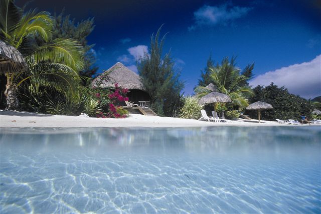
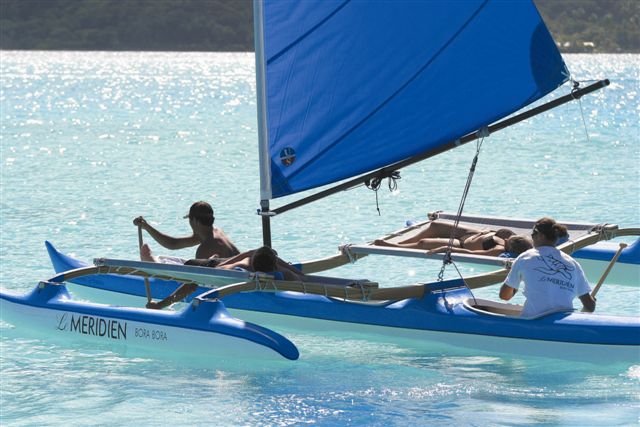
<img src="../images/2.jpg" alt="holiday" width="20%" height="auto"/>
</div>
<style>
#d{background-color:blue; color: lightgrey; padding: 1vw;text-align: center;margin-left: 5vw; width: 10vw; height: 4vw;}
#d:hover{background-color:orange; transform: translate(-2vw, -3vw); transition: all 1s;}
.buttonval {margin-left: 5vw; background-color: aqua; color: black; padding:1vw 2vw;}
.buttonval:hover {background-color:tomato; transform: scale(2); transition: all 2s;}
img{margin-left: 5vw;}
img:hover {margin-left: 10vw; border: 1vw solid red; transition: all 1s;}
</style>
tooltip hover example
            <div>
                <div>
                    <div id="e">hover over me to see the p element
                        <p id="f">Here I am!</p>
                </div>
                <br>
                <div>
                    <a href="#" data-tip="this is a tooltip"> Hover over me. </a>
                </div>
            </div>
            <style>
                #e{margin-left: 5vw; color: black;}
                #f{display: none; background-color: black; width: 7vw; padding: 0.2vw;}
                #e:hover #f{display: block; background-color:white;margin-left: 2vw;}
                a[data-tip] {display: block; position: relative; margin-left: 5vw; padding-top: 2vw; }
                a[data-tip]:hover::after, a[data-tip]:focus::after {content: attr(data-tip); position: relative; left: 1vw; top: 0.4vw; min-width: 20vw; border-radius: 5%;
                    background-color: rgba(0, 0, 0, 0.5); padding: 1vw; color: white; font-size: 1vw;z-index: 1;}

            </style>
            <div class="my-div">
                <span>1</span>
                <div>b</div>
                <span>2</span>
                <div>a</div>
                <span>3</span>
            </div>
            <style>
                .my-div > * {border:0.5vw solid green; width: 40vw;}
            </style>
This paragraph is under the div.set element
This paragraph2 is under the div.set element.
This paragraph is not under the div.set element. As it is not the child element of div
Even This paragraph is under the div.set element.
This paragraph is not under the div.set element.
This paragraph is not under the div.set element.
            <div>
                <div class="set">
                    <p>This paragraph is under the div.set element</p>
                    <p>This paragraph2 is under the div.set element. </p>
                    <section><p>This paragraph is not under the div.set
                    element. As it is not the child element of div</p></section>
                    <p> Even This paragraph is under the div.set element. </p>
                </div>
                <p>This paragraph is not under the div.set element. </p>
                <p>This paragraph is not under the div.set element. </p>
            </div>
            <style>
            .set{width: 40vw;}
                div .set > p {background-color: salmon; font-size : 1.2vw; padding: .3vw;}
            </style>
Paragraph 3
            <div>
                <div class="example">
                    <span class="one">Paragraph 1</span><br>
                    <span class="one">Paragraph 2</span>
                    <p>
                        <span class="one">Paragraph 3</span>
                    </p>
                </div>
                <span class="one">Paragraph 4</span><br>
                <span class="one">Paragraph 5</span>
            </div>
            <style>
                span .one {display: block;}
                div.example, div.example > * {background-color: #9ba2a3; width: 40vw;}
            </style>
Exam begins at 11AM.
            <article>
                <div class="two">Exam Details</div>
                <div class="two"><p>Exam begins at 11AM.</p></div>
                <span><div class="two"> Do not bring cell phone.</div>
                </span>
                <div class="two">
                    <div>Candidates should reach the center till 10:45.
                    </div>
                    <br/>
                    The candidates need to be bring the Admit Card.
                </div>
            </article>
            <style>
                article > div.two { border: dashed midnightblue; width: 45%;}
                div.two > p {font-size: 2vw; font-style: italic; box-shadow: inset 0 0
                    .8vw orange;}
            </style>
Lorem ipsum dolor sit amet, consectetur adipiscing elit. Donec a urna elit. Integer malesuada tempus enim nec rhoncus. Aenean tempus adipiscing porttitor.
Quisque aliquam nunc vel arcu varius aliquam. Vestibulum euismod nulla id nulla suscipit sollicitudin.
First Child so CSS styling applicable here.
Second Child so CSS styling NOT applicable here.
            <div>
                <div id="g">
                    <p>Lorem ipsum dolor sit amet, consectetur adipiscing elit. Donec a
                    urna elit. Integer malesuada tempus enim nec rhoncus. Aenean tempus
                    adipiscing porttitor.</p>
                    <p>Quisque aliquam nunc vel arcu varius aliquam. Vestibulum euismod
                    nulla id nulla suscipit
                    sollicitudin.</p>
                </div>
                <br>
                <div id="h">
                    <p >First Child so CSS styling applicable here.</p>
                    <p >Second Child so CSS styling NOT applicable here.</p>
                </div>
                <br>
                <div id="i">
                    <em>style applied here - 1st child in div - - </em>
                    <em>No style here - 2nd child in div</em><br>
                </div>
                <br>
                <ol id="j">
                    <li>bread - 1st child </li>
                    <li>butter - 2nd child </li>
                    <li>Egg - 3rd child </li>
                </ol>
            </div>
            <style>
                #i, #j{margin-left: 1vw; }
                #g p:first-child{color:red;}
                #h p:first-child {padding:0.5vw; border: 2px solid red; display: block; width: 40vw;}
                #i em:first-child {text-align:center; padding:0.5vw; border:
                    2px solid red;}
                #j li:first-child{text-decoration: red wavy underline;}
            </style>
This text isn't selected.
This text is selected!
This text isn't selected.
main menu - layout
            <div>
                <div id="last">
                    <p>This text isn't selected.</p>
                    <p>This text is selected!</p>
                </div>
                <br>
                <div id="last-2">
                    <p>This text isn't selected.</p>
                    <h3>This text isn't selected: it's not a `p`.</h3>
                </div>
                <br>
                <p style="font: 1.25vw sans-serif; color:black;">main menu - layout</p>
                <ul class="main-menu">
                    <li>Home</li>
                    <li>About</li>
                    <li>Contact</li>
                    <li>Members</li>
                </ul>
            </div>
            <style>
                #last .afstand{margin-left: -5vw;}
                #last p:last-child {color: lime;background-color: black; padding: 5px; width: 40vw;}
                #last-2 h3{margin-left: 5vw;}

                li {list-style: none; display: inline; padding: 20px;font-family: arial;}
                .main-menu {margin-left: 5vw;background: #2d7484;color: #fff;padding:  20px;max-width: 40vw;}
                .main-menu :not(:last-child) {border: solid 1px #ddd;color: #ea9e12;}
            </style>
matches the element which is the target of the document URL.
Click on the links above and the :target selector highlight the current active HTML anchor.
new content 1...
new content 2...
new content 3...
new content 4...
            <div>
                <div id="pick">topics to be explored
                    <ul>
                        <li><a href="#topic1">topic 1</a></li>
                        <li><a href="#topic2">topic 2</a></li>
                        <li><a href="#topic3">topic 3</a></li>
                        <li><a href="#topic4">topic 4</a></li>
                        <li><a href="#topic5">topic 5</a></li>
                    </ul>
                    <ol>
                        <li id="topic1"><h3>CSS</h3></li>
                        <li id="topic2"><h3>HTML</h3></li>
                        <li id="topic3"><h3>JAVA</h3></li>
                        <li id="topic4"><h3>PHP</h3></li>
                        <li id="topic5"><h3>C++</h3></li>
                    </ol>
                </div>
                <br>
                <div id="new">new content
                    <p><a href="#news1">jump to new content 1</a></p>
                    <p><a href="#news2">jump to new content 2</a></p>
                    <p><a href="#news3">jump to new content 3</a></p>
                    <p><a href="#news4">jump to new content 4</a></p>
                    <p>Click on the links above and the :target selector highlight
                    the current active HTML anchor.</p>
                    <p id="news1"><b>new content 1...</b></p>
                    <p id="news2"><b>new content 2...</b></p>
                    <p id="news3"><b>new content 3...</b></p>
                    <p id="news4"><b>new content 4...</b></p>
                </div>
            </div>
            <style>
                #pick, #new{margin-left: 5vw;}
                ul li a{display: block; padding: 0.5vw; text-decoration: none;
                    color: blue;}
                #pick :target {background-color: Gold; width: 20vw; transform:
                    scale(1.5) translate(4vw);
                    transition: all 1s;}
                #new :target {border: 2px solid #D4D4D4;background-color: #e5eecc;
                    width: 30vw;transform: scale(1.05) translate(4vw); transition:
                    all 1s;}
            </style>
move mouse over the links to see the change in layout.
            <div>
                <p>move mouse over the links to see the change in layout.</p>
                <p><a class="ex1" href="#">This link changes color</a></p>
                <p><a class="ex2" href="#">This link changes font-size</a></p>
                <p><a class="ex3" href="#">This link changes background-color</a></p>
                <p><a class="ex4" href="#">This link changes font-family</a></p>
                <p><a class="ex5" href="#">This link changes text-decoration</a></p>
                <div class="pre">
                <p class="pre" style="color: darkblue">Codes:
            </div>
            <style>
                a.ex1:hover, a.ex1:active {color: red;}
                a.ex2:hover, a.ex2:active {font-size: 150%;}
                a.ex3:hover, a.ex3:active {background: red;}
                a.ex4:hover, a.ex4:active {font-family: monospace;}
                a.ex5:visited, a.ex5:link {text-decoration: none;}
                a.ex5:hover, a.ex5:active {text-decoration: underline;}
            </style>
Note: The :active selector styles the active link.
            <div>
                <button id="two"><a href="#">Button</a></button><br>
                <p><a id="two_one"href = "">Click This Link</a></p>
                <p><a id="two_two" target="_blank" href="https://www.lwitters.com">
                go to my website</a></p>
                <p><a id="two_three" target="_blank" href="http://www.wikipedia.org">
                go to wikipedia.org</a></p>
                <p><b>Note:</b> The :active selector styles the active link.</p>
            </div>
            <style>
                button{margin-left: 5vw;}
                #two {background-color: aqua; padding:1vw 2vw;}
                #two:active, #two a:active {background-color:yellow; color: red;}
                #two:hover:after{content:" - - - turns yellow and red when active - - - ";}
                #two_one:active {color: #FF00CC}
                #two_two:active, #two_three:active {background-color: yellow;}
            </style>
This link goes to my website. After it's been visited, it will turn orange.
This link goes to Wikipedia. After it's been visited, its border will turn black.
            <div>
                <div class="visit">
                    <a href="#test-visited-link">Have you visited this link yet?</a><br>
                    <a href="">You've already visited this link.</a>
                </div>
                <section>
                    <p><a href="https://lwitters.com" clas="lwitters">This link goes to my website.
                    After it's been visited, it will turn orange.</a></p>
                    <p><a href="https://www.wikipedia.com" class="wikipedia">This link goes to Wikipedia.
                    After it's been visited, its border will turn black.</a></p>
                    <p><a href="https://www.google.com" class="google">This link goes to Google.
                    After it's been visited, it will turn white and the background will turn orange. </a></p>
                </section>
            </div>
            <style>
                .visit a {background-color: white;border: 1px solid white; margin-left: 5vw;}
                .visit a:visited {background-color: yellow; border-color: hotpink; color: hotpink;}
                a.lwitters {color: green;}
                a.lwitters:visited {color: #E18728;}
                a.wikipedia{border: 2px solid blue;}
                a.wikipedia:visited {border: 2px solid black;}
                a.google {background-color: yellow;color: black;}
                a.google:visited {background-color: #E18728;color: white;}
                section {max-width: 60vw; font-size: 1vw; font-family: Helvetica, sans-serif;}
            </style>
            <div id="update" style="margin-left:4vw;">
                <a href="https://ww.lwitters.com">Medium</a><br>
                <a>Lorem ipsum dolor sit amet</a>
            </div>
            <style>
                #update a:any-link {color: red;}
            </style>
Set the width of the input field to 100 pixels. However, when the input field gets focus, make it 250 pixels wide:
Search:
            <div>
                <div class="search">
                    <p>Set the width of the input field to 100 pixels. However, when the input field
                    gets focus, make it 250 pixels wide:</p>
                    <p>Search: <input type="text" name="search"></p>
                </div>
                <br>
                <div>
                    <input class="red-input" value="I'll be red when focused."><br>
                    <input class="blue-input" value="I'll be blue when focused.">
                </div>
                <br>
                <form class="fc" action="" method="post">
                    <div class="container">
                        <label>Username</label>
                        <input type="text" name="uname" required>

                        <label>Password</label>
                        <input type="password" name="pass" required>

                        <button type="submit">Sign in</button>
                    </div>
                </form>
            </div>
            <style>
                .search input[type=text] {width: 100px;-webkit-transition:
                    width .35s ease-in-out; transition: width .35s ease-in-out;}
                .search input[type=text]:focus {width: 30vw; background-color: burlywood;}

                .red-input, .blue-input{margin-left: 1vw;}
                .red-input:focus {background: yellow; color: red;}
                .blue-input:focus {background: yellow;color: blue;}

                .fc{margin-left: 1vw; box-shadow: 0 1px 3px rgba(50, 50, 93, .15), 0 1px 0
                    rgba(0, 0, 0, .02); border: 1px solid #d7d7d7; background-color: #FFF;
                    width: 30vw;}
                .fc input[type=text], input[type=password] {width: 100%; padding: 1.2vw 2vw;
                    margin: 1vw 0; display: inline-block; border: 1px solid #ccc; box-sizing:
                    border-box; box-shadow: 0 1px 3px rgba(50, 50, 93, .15), 0 1px 0
                    rgba(0, 0, 0, .02);}
                .fc input:focus {background-color: aqua;}
                .fc button {background-color: #4CAF50; color: #FFF; margin: 8px 0;
                    border: none; cursor: pointer;
                    box-shadow: 0 2px 5px 0 rgba(0, 0, 0, .26); min-width: 12vw;
                    border-radius: 2px; padding: 1vw
                    1.2vw;}
                .container {padding: 1.2vw;}
            </style>
            <div>
                <p>Try typing into this form.</p>
                <form class="fcw">
                    <label for="given_name">Given Name:</label>
                    <input id="given_name" type="text">
                    <br>
                    <label for="family_name">Family Name:</label>
                    <input id="family_name" type="text">
                </form>
                <br>
                <div class="my-element">
                    <p>A paragraph</p>
                    <p><a target="_blank" href="https://lwitters.com">My Website
                    </a></p>
                    <label for="lw_email">Your email:</label>
                    <input type="email" id="lw_email" />
                </div>
            </div>
            <style>
                .fcw {border: 1px solid; color: darkgray; padding: 1vw; margin-left: 1vw; width: 30vw;}
                .fcw input{margin: 0.4vw;}
                .fcw:focus-within{background:orange; color: black;}
                .my-element *:focus {background: yellow !important; color: #000;}
                label{padding-left: 5vw;}
                .my-element{width: 40vw;}
                .my-element:focus-within {outline: 3px solid #333; width: 40vw; margin-left: 5vw;}
            </style>
            <div id="update1" style="margin-left:4vw;">
                <button>Save</button>
                <button>Submit</button>
            </div>
            <style>
            button:focus-visible {background-color: green; color: skyblue;}
            </style>
matches when an <input> has been autofilled by the browser. The class stops matching if the user edits the field.
            <form>
                <label for="email">Email</label>
                <input type="email" name="email" id="email" />
            </form>
            <style>
                input:-webkit-autofill {  box-shadow: 0 0 0px 10vw seagreen inset;
                    -webkit-text-fill-color: white;}
            </style>
matches elements based on the language they are determined to be in.
This paragraph is English, but the language is not specifically defined.
This paragraph is defined as British English.
Ce paragraphe est défini en français.
I live in Italy.
Ciao bella!
            <div>
                <div>
                    <p>This paragraph is English, but the language is not specifically defined.</p>
                    <p lang="en-GB">This paragraph is defined as British English.</p>
                    <p lang="fr">Ce paragraphe est défini en français.</p>
                </div>
                <div>
                    <p>I live in Italy.</p>
                    <p lang="it">Ciao bella!</p>
                </div>
            </div>
            <style>
                .output {font: 1vw 'Fira Sans', sans-serif;}
                p::before {padding-right: 5px;}
                [lang="en-GB"]::before {content: url('british.jpg');}
                [lang="fr"]::before {content: url('french.png'); width: 10%;}

                p:lang(it) {background: yellow; width: 30vw; margin-left: 5vw;}
            </style>
            <div>
                <div class="choose">
                    <input type="radio" name="my-input" id="yes">
                    <label for="yes">Yes</label>

                    <input type="radio" name="my-input" id="no">
                    <label for="no">No</label>
                </div>
                <br>
                <div class="tick">
                    <input type="checkbox" name="my-checkbox" id="opt-in">
                    <label for="opt-in">Check me!</label>
                </div>
                <br>
                <select name="my-select" id="fruit">
                    <option value="opt1">Apples</option>
                    <option value="opt2">Grapes</option>
                    <option value="opt3">Pears</option>
                </select>
                <br><br>
                <form id="fill" action="">
                    <input type="radio" checked="checked" value="male" name="gender"> Male<br>
                    <input type="radio" value="female" name="gender"> Female<br>
                    <input type="checkbox" value="Bike"> I have a bike<br>
                    <input type="checkbox" value="Car"> I have a car
                </form>
            </div>
            <style>
                div.choose, div.tick, select {margin-left: 5vw; padding: -5vw;}
                .choose label, .tick label{margin: 0;padding: 0;}
                /* Labels for checked inputs */
                input:checked + label {color: red;}
                /* Radio element, when checked */
                input[type="radio"]:checked {box-shadow: 0 0 0 3px orange;}
                /* Checkbox element, when checked */
                input[type="checkbox"]:checked {box-shadow: 0 0 0 3px hotpink;}
                /* Option elements, when selected */
                option:checked {box-shadow: 0 0 0 3px lime; color: red;}

                #fill{display: flex; flex-flow: column nowrap; justify-content: space-around;
                    margin-left: 5vw;margin-top: 2vw;}
                #fill input{margin: 0; padding:0;}
                #fill input:checked {height: 50px; width: 50px;}
            </style>
codes
        <style>
             .a > span, .b > span, .c > span {...}
        </style>

        equals

        <style>
            :where (.a, .b, .c) > span {...}
        </style>
Here is my main content. This contains a link.
Here is my main content. This contains a link.
            <div class="spec">
                <article>
                    <h3>:is()-styled links</h3>
                    <section class="is-styling">
                        <p>Here is my main content.
                        This <a href="https://mozilla.org">contains a link</a>.
                    </section>
                    <aside class="is-styling">
                        <p>Here is my aside content.
                        This <a href="https://developer.mozilla.org">
                        also contains a link</a>.
                    </aside>
                    <footer class="is-styling">
                        <p>This is my footer, also containing
                        <a href="https://github.com/mdn">
                        a link</a>.
                    </footer>
                </article>
                <article>
                    <h3>:where()-styled links</h3>
                    <section class="where-styling">
                        <p>Here is my main content.
                        This <a href="https://mozilla.org">
                        contains a link</a>.
                    </section>
                    <aside class="where-styling">
                        <p>Here is my aside content. This <a
                        href="https://developer.mozilla.org">
                        also contains a link</a>.
                    </aside>
                    <footer class="where-styling">
                        <p>This is my footer, also containing <a
                        href="https://github.com/mdn">
                        a link</a>.
                    </footer>
                </article>
            </div>
            <style>
                :is(section.is-styling, aside.is-styling, footer.is-styling) a
                {color: red;}
                :where(section.where-styling, aside.where-styling,
                footer.where-styling) a{color: orange;}
                footer a {color: blue;}
            </style>
            <div>
                <div>
                    <h3>First list no class</h3>
                    <ol>
                        <li>List Item 1</li>
                        <li>List Item 2</li>
                    </ol>
                </div>
                <div>
                    <h3>Second list with class</h3>
                    <ol class="second-list">
                        <li>List Item 1</li>
                        <li>List Item 2</li>
                    </ol>
                </div>
                <div>
                    <h3>Third list with class</h3>
                    <ol class="third-list">
                        <li>List Item 1</li>
                        <li>List Item 2</li>
                    </ol>
                </div>
            </div>
            <style>
                .second-list {list-style-type: disc;}
                :where(ol[class]) {list-style-type: none;}
                .third-list{list-style-type: square;}
            </style>
The functional :has() CSS pseudo-class represents an element if any of the relative selectors that are passed as an argument match at least one element when anchored against this element. This pseudo-class presents a way of selecting a parent element or a previous sibling element with respect to a reference element by taking a forgiving relative selector list as an argument.
The :has() pseudo-class takes on the specificity of the most specific selector in its arguments the same way as :is() and :not() do.
syntax: :has( <forgiving-relative-selector-list> )
The relative selector list parameter is forgiving. Normally in CSS, when a selector in a selector list is invalid, then the whole list is deemed invalid. When a selector in a ":has() selector list" fails to parse, the incorrect or unsupported selector will be ignored and the others will be used.
Note that if the :has() pseudo-class itself is not supported in a browser, the entire selector block will fail (unless :has() itself is in a forgiving selector list, such as in :is() and :where()).
The :has() pseudo-class cannot be nested within another :has(). Also, pseudo-elements are not valid selectors within :has(). This is because many pseudo-elements exist conditionally based on the styling of their ancestors and allowing these to be queried by :has() can introduce cyclic querying.
While :has() and pseudo-elements are not valid :has() selectors, as the selector list is forgiving, they will just be ignored. The selector will not fail.

            <div>
                <figure class="one">
                    <img src="../images/2018-Sh-01.jpg" alt="shanghai">
                </figure>
                <figure class="one">
                    <img src="../images/2018-Sh-02.jpg" alt="shanghai-2">
                    <figcaption>holiday souvenirs</figcaption>
                </figure>

            </div>
            <style>
                figure.one img{width: 30%;}
                figure.one:has(figcaption){background-color: skyblue; padding: 0.5vw; width: 40%;}
            </style>
:has() can be easy.
                        figure:has(pre) {
                            background: rgb(252, 232, 255);
                            border: 3px solid white;
                            padding: 1rem;
                        }
<div>
<article">
<figure class="two">
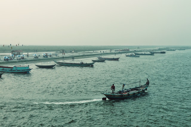
<img src="../images/3a.jpg" alt="river activity">
</figure>
<figure class="two">
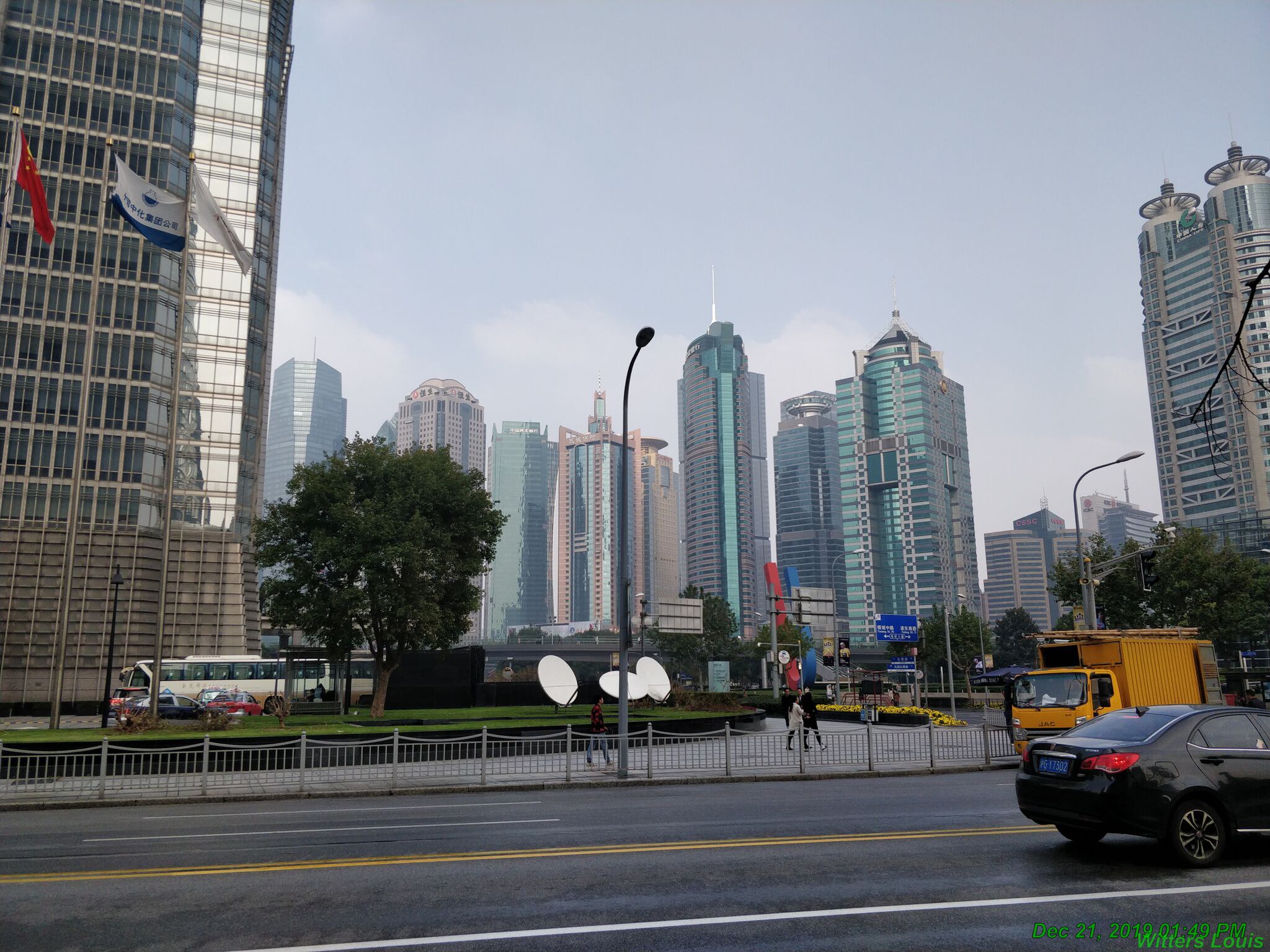
<img src="../images/19.jpg" alt="highway">
<figcaption>highway in the city of Shanghai.</figcaption>
</figure>
<figure class="two">
<figcaption>Using <code>:has()</code> can be easy.</figcaption>
<pre class="pre">
<code>
figure:has(pre) {
background: rgb(252, 232, 255);
border: 3px solid white;
padding: 1rem;
}
</code>
</pre>
</figure>
</article>
</div>
<style>
.two{ margin: 0; box-shadow: 1px 1px 4px rgba(1, 1, 1, 0.4); width: 40vw;}
.two:has(figcaption) {background: white; padding: 0.5vw;}
.two:has(.pre) { background: rgb(252, 232, 255); border: .3vw solid burlywood; padding: 1vw;}
.two:not(:has(:not(img))) {display: flex;}
.two:has(img) figcaption {font-size: 90%; font-style: italic; margin: 0.6vw 0 0.1vw;}
.two figcaption {font-family: georgia; color: blue;}
.two:has(.pre) figcaption {margin: 0.6vw 0 0.1vw;}
.two img {max-width: 40%; display: block; object-fit: cover;}
.two.pre {font-family: Courier New, monospace; margin: 0; color: rgb(159, 43, 148);}
.een {margin: 2vw; display: grid; grid-template-columns: repeat(auto-fit, minmax(10vw, 1fr));gap: calc(1rem + 2vw);font-family: georgia;}
</style>
Here's the description of this article, if you decide to click through to read it.
This is a shorter description.
Lorem ipsum dolor sit amet, consectetur adipiscing elit.
Ut enim ad minim veniam, quis nostrud exercitation ullamco laboris nisi ut aliquip ex ea commodo consequat.
Duis aute irure dolor in reprehenderit in voluptate.
Read about :has( ) at MDN.
            <main>
                <article class="art">
                    <h4>This is an article headline</h4>
                    <p>Here's the description of this article, if you decide to click through
                    to read it.</p>
                </article>
                <article class="art">
                    <h4>This is a teaser for another article</h4>
                    <p>This is a shorter description.</p>
                </article>
                <article class="art">
                    <h4>Flooding</h4>
                    <img src='../images/6.jpg' alt=''>
                        <p>Lorem ipsum dolor sit amet, consectetur adipiscing elit.</p>
                </article>
                <article class="art">
                    <h4>more flooding</h4>
                    <img src='../images/7.jpg' alt=''>
                    <p>Ut enim ad minim veniam, quis nostrud exercitation ullamco laboris nisi
                    ut aliquip ex ea commodo consequat.</p>
                </article>
                <article class="art">
                    <h4>Lorem ipsum</h4>
                    <p>Duis aute irure dolor in reprehenderit in voluptate.</p>
                </article>
                <article class="art">
                    <h4>:has( )</h4>
                    <p>Read about <a href="https://developer.mozilla.org/en-US/docs/Web/CSS/:has"
                    >:has( ) at MDN</a>.</p>
                </article>
            </main>
            <style>
                main {display: grid; grid-template-columns: repeat(auto-fit, minmax(15vw, 1fr)); gap:
                    1vw; margin: 1vw;}
                .art {background: lightgreen; background: color(display-p3 0.925 0.912 0.865);
                    border-radius: 1vw; padding: 1vw;       display: flex; flex-flow: column;}
                .art:has(img) {grid-column: span 2;grid-row: span 2;}
                img {order: -1;}
                h4 {margin: 0; font-weight: 600; line-height: 1.1; color:darkolivegreen;}
                h4 + p {margin-top: 0.33vw;}
                .art:has(img) h4 {margin-top: 1vw;}
                .art p {margin-bottom: 0; font-size: 0.8vw;}
                main a {text-decoration-thickness: 0.4vw; text-decoration-color: rgba(9, 146, 163, 0.3);
                    text-underline-offset: -0.2vw;
                text-decoration-skip-ink: none; color: inherit;}
                main a:hover { color: inherit; color: rgba(9, 146, 163, 1); }
                .art img { max-width: 70%;}
            </style>
            <main class="twee">
                <a href="#">
                <figure>
                <img src='../images/9.jpg' alt=''>
                    <figcaption>This image is wrapped in a figure element.</figcaption>
                </figure>
                </a>
                <a href="#">
                <img src='../images/8.jpg' alt=''>
                </a>
            </main>
            <style>
                .twee a:has(img) {border: 0.5vw solid darkolivegreen; background: palegoldenrod; color: saddlebrown;}
                .twee a:has(> img) {border: 0.5vw solid chocolate; background: pink;}
                .twee a {display: block; text-decoration: none;}
                .twee img { max-width: 90%; display: block;}
                .twee p {margin: 0.5vw 0 0;}
                .twee {margin: 1.5vw 1vw; display: grid; grid-template-columns: 15vw 15vw; gap: 1vw; font-family: Avenir, Helvetica;
                    font-size: 0.8vw; align-items: start;}
                .twee figure {margin: 0;}
                .twee figcaption {padding: 0.5vw;}
            </style>
            <article class="drie">
                <form>
                    <div>
                        <label for="name">Name</label>
                        <input type="text" id="name">
                    </div>
                    <div>
                        <label for="site">Website</label>
                        <input type="url" id="site">
                    </div>
                    <div>
                        <label for="email">Email</label>
                        <input type="email" id="email">
                    </div>
                </form>
                <footer>
                    <input type="checkbox" id="check"> <label for="check">Dark mode</label>
                </footer>
            </article>
            <style>
                @layer basic, focus, darkmode, invalid;
                /* Styling when a field has focus */
                @layer focus {
                    form:has(:focus-visible) {background: antiquewhite; border: 0.4vw solid antiquewhite;}
                    /* -- Styling other fields when one field has focus -- */
                    form:has(:focus-visible) div:has(input:not(:focus-visible)) label {color: peru;}
                    form:has(:focus-visible) div:has(input:not(:focus-visible)) input {border: .2vw solid peru; }
                } /* End "focus" layer */
                /* Styling field if input is invalid */
                @layer invalid {
                    input:invalid {outline: .4vw solid red; border: .2vw solid red;}
                    div:has(input:invalid) label {color: crimson;}
                    label:has(+ input:invalid)::before {content: '✖ ';color: crimson;}
                } /* End "invalid" layer */
                /* Dark Mode when checkbox checked */
                @layer darkmode {
                    body:has(input[type="checkbox"]:checked) {background: blue; --primary-color: white;}
                    body:has(input[type="checkbox"]:checked) form {border: .4vw solid white; }
                    body:has(input[type="checkbox"]:checked) form:has(:focus-visible) {background: navy;}
                    body:has(input[type="checkbox"]:checked) input:focus-visible {outline: .3vw solid
                        lightsalmon; border: .2vw solid lightsalmon; /* needed for Chrome */}
                } /* End "darkmode" layer */
                /* Basic styling */
                @layer basic {
                /* ---- Layout ---- */
                .drie {display: grid; grid-template-columns: 10vw auto ; grid-template-rows: min-content max-content 1fr; grid-column-gap: calc(2vw + 0.5rem);}
                .drie form {grid-column: 2 / 3; height: 20vw;}
                .drie footer {width: 100%; }
                /* -- Basic form styling -- */
                .drie form { border: .4vw solid white; padding: 2vw 3vw; width: min-content;}
                .drie form label, form input {display: block;}
                .drie label, .drie input {font-size: 1.2vw; font-family: Avenir, Helvetica, sans-serif;}
                .drie div {margin: 1.25vw 0;}
                .drie input {margin: 0.25vw 0; padding: 0.5vw; appearance: none; border: .2vw solid
                    var(--primary-color);}
                .drie :focus-visible {outline: .4vw solid sienna; border: .2v solid sienna;
                    /* needed for Chrome */}
                .drie input[type="checkbox"] {float: left; margin-right: 0.66vw; }
                .drie footer:has(input[type="checkbox"]) label {display: inline-block; margin:
                    .1vw 0 0;}
                /* -- Custom checkbox styling -- */
                @supports(appearance: none) {
                    input[type="checkbox"] { appearance: none; width: 1.6vw; height: 1.6vw; border:
                        .2vw solid var(--primary-color);           background: white; margin-top: 0; }
                    input[type="checkbox"]:checked {position: relative; background: none;}
                    input[type="checkbox"]:checked::after {position: absolute; top: 0.35vw; left: 0.12vw;
                        content: ""; width: 0.9vw;   height: 0.3vw; border: .4vw solid var(--primary-color);
                        border-right: none; border-top: none; transform: rotate(-45deg);}}
                } /* End "basic" layer */
            </style>
code:
                <main class="vier">
                    <h3>Choose a theme</h3>
                    <menu>
                        <label for="color-mode">Options:</label>
                        <select name="color-mode" id="color-mode">
                            <option value="pony">Pony</option>
                            <option value="wine">Wine</option>
                            <option value="molly">Molly</option>
                            <option value="zeldman">Zeldman</option>
                        </select>
                    </menu>
                </main>
                <style>
                .vier {display: block; width: 30vw; height: 20vw; color: var(--text-color); background-color: var(--main-background);padding: 1vw;
                    font-family: var(--font-family);}
                h4 {margin: 0; font-weight: 400; font-size: 2vw;}
                .vier:has(option[value="pony"]:checked) {--font-family: cursive; --text-color: #b10267; --body-background: #ee458e;
                --main-background: #f4b6d2;}
                .vier:has(option[value="wine"]:checked) {--font-family: avenir, helvetica; --text-color: white; --body-background: black;
                --main-background: brown;}
                .vier:has(option[value="molly"]:checked) {--font-family: helvetica; --text-color: skyblue; --body-background: #6c3;
                --main-background: #09c; }
                .vier:has(option[value="zeldman"]:checked) {--font-family: georgia; --text-color: black; --body-background: #c30;
                    --main-background: #f60; }
                </style>
            <div class="container">
                <div class="form">
                    <div class="form_group">
                        <label for="ONE"><i>email</i>
                            <input type="email" name="" id="ONE">
                        </label>
                    </div>
                </div>
            </div>
            <style>
                .form_group label{font-size: 1.4vw;margin-left: 2vw;}
                .form_group #ONE {border: 0.4vw solid blue;border-radius: 10vw; color: lightgrey;
                    font-family: 'Montserrat', sans-serif; font-size: 2vw; outline: none; padding:
                    .5vw 1.5vw; width: 20vw;}
                .form_group #ONE:focus {border: 0.5vw inset purple;color: black;}
                .form_group #ONE:not(:focus):invalid {background:crimson; border: 0.5vw inset purple;
                    color: pink;}
            </style>
code:
                <div class="container-2">
                    <div class="btn">Grow!</div>
                    <div class="balloon"></div>
                </div>
                <style>
                    .btn {margin-left: 1vw; background: black;color: white; text-align: center; font-size: 2vw; width: 8vw; height: 4vw;cursor: pointer; padding: 0.5vw 1vw;
                        border-radius: 5vw;}
                    .balloon {margin-left: 1vw; width: 30vw; height: 20vw; background: blue;  padding-bottom: 1vw; border-radius:40%; transform: scale(0.2, 0.1);
                        transition: transform 4000ms;}
                    .btn:hover + .balloon{transform: scale(2.5, 1) translateX(10vw); animation: coloring 0.5s linear infinite;}
                    @keyframes coloring{
                        0%{background-color: blue;}
                        100%{background-color: red;}
                    }
                </style>
I'm a paragraph with all kinds of information.
Let's add another paragraph for fun.
yadda yadda yadda
blah blah blah
yadda yadda yadda
blah blah blah
And maybe just one more.
            <article>
            <h3>Here's a h3 Header</h3>
            <p>I'm a paragraph with all kinds of information.</p>
            <p>Let's add another paragraph for fun.</p>
            <h3>Here's a another h3 Header</h3>
            <p>yadda yadda yadda</p>
            <p>blah blah blah</p>
            <p>yadda yadda yadda</p>
            <h3>Here's a h3 Subheader</h3>
            <p>blah blah blah</p>
            <p>And maybe just one more.</p>
            <h3>Here's another h3 Header</h3>
            </article>
            <style>
                article{margin-left: 5vw; font-size: 2vw;}
                article p:nth-child(odd) {color: goldenrod;}
                article h3:nth-of-type(even) {color: green;}
                article p:nth-child(odd):before{content: "('odd' p child) - - - ";
                color: red; font-size:1vw;
                font-weight: bold;}
                article h3:nth-of-type(even):before{content: "('even' h3 child) - - -  ";
                color: red;
                font-size:1vw;}
            </style>
            <ul class="old">
                <li class="last">Item 1</li>
                <li class="last">Item 2</li>
                <li class="last">Item 3</li>
                <li class="last">Item 4</li>
                <li class="last">Item 5</li>
                <li class="last">Item 6</li>
                <li class="last">Item 7</li>
                <li class="last">Item 8</li>
                <li class="last">Item 9</li>
            </ul>
            <style>
                    li.last:nth-child(3n + 1) {background-color: black;}
                    li.last:nth-child(3n + 2) {background-color: yellow; color: rgba(0, 0, 0, 0.7);}
                    li.last:nth-child(3n + 3) {background-color: red;}
                    ul .old {list-style: none; margin: 0 7vw; padding: 0;  min-height: 100vh;display: grid;}
                    li .last{display: grid; place-content: center; padding: 1vw 0.5vw; text-align: center ;
                        color: rgba(255, 255, 255, 0.95);   font-weight: bold; font-size: 2vw;}
            </style>